


ZARA
UX review by Artem Kulitski.
Sorry ZARA, but your web page is not OK.
I have been your customer in Poland, but wanted to try an online purchase as well. I navigated to your site and was a bit surprised that some things are really frustrating there.
The biggest frustration happened, when I scrolled down and heard a loud music with video, which came absolutely unexpected from nowhere. I tried to switch it off immediately, but had no idea how to do that, so I just switched off my sound on Mac. That was the biggest frustration and confusion.
It could sound “creative” in the past old days, but it was a really bad experience for me. Your brand is great, but I am thinking you still need to work on the online presence.
As a user experience designer I want to see web/app products that make people happy. So, I decided to run a quick remote user experience testing. I asked my (non-tech) friends Alex and Natalia to navigate to the site and share their thoughts and experience to see how other users feel about starting their journey on ZARA website. I am not taking into account their purchasing experience for now.
Considering their feedback, let’s go straight into the issues with their level of severity:
1. Minor: Causes some hesitation or slight irritation.
2. Moderate: Causes occasional task failure, delays and moderate irritation.
3. Critical: Leads to task failure. Causes user extreme irritation.
Sliding carousel.
Minor: Causes some hesitation or slight irritation.
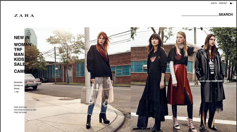
Alex: I was interested in these photos, but they slide too fast, and I couldn’t figure out how to control them.
Natalia: Great images with collections! But how can I stop the sliding? I wanted to see SALE collection, so waited for it to slide again, but when it did, I couldn’t understand where I should click to see it. Maybe I was missing a button, because it was so quick. Then I found a SALE text on the left menu.
Summary: Rotating images have been tested many times and are considered to be a poor way of presenting home page content. They may seem cool, and could be appropriate for your industry, but the users want control. If you can, avoid these carousels. They slide very fast, and the users feel that they are just for entertaining purpose. If you want conversion — put one image with some clear call to action on the item or feature that users will definitely benefit from. If you still want to keep the carousel, give your users the control. And test, test, test. But the data shows that carousels are conversion killers.
Music video.
Critical: Leads to task failure. Causes user extreme irritation.
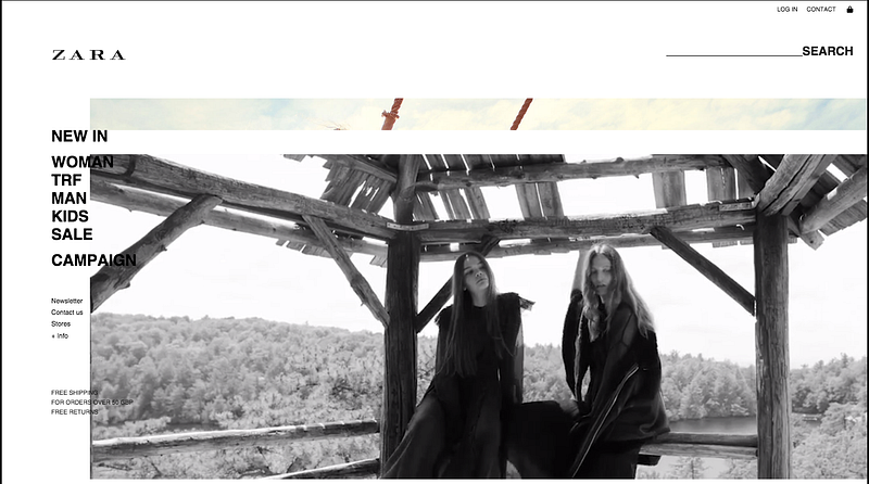
As I mentioned above, it was a real disaster, when this video appeared and played out loud with all the office staring at me. It is a very poor User Experience. So, what our tested user say:
Alex: I closed the browser tab immediately when I heard the music. There was no other option.
Natalia: I was listening to my music, and that music video overlapped it. I like such music style, but not when I am already listening to Film Screening Series #2: Foresteppe, which is very quiet and relaxing. Had to reload the page, because there was no play/pause/stop or anything!
Summary: Well, I think the above feedback tells everything. Maybe you like this music, but not your users. There is a big list of reasons why not to play automatic music on your website. It is against all usability principles and rule books. But most important, you’re driving people away from your website. Give the user a quick and simple way of choosing to turn audio on only if they want it.
FYI: I didn’t run a website speed test, but fixing the above issues may also increase the page speed. Amazon found out that if they were to slow down their page load time by 1 second, it would cost them $1.6 Billion per sales year.
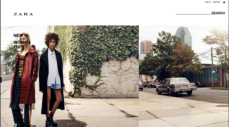
Navigation menu.
Moderate: Causes occasional task failure, delays and moderate irritation.
I will go straight into summary. The menu overlaps the image and looks like something is broken there. Maybe it was a design decision, but really not the UX. Some items are not even readable. The items are too close to each other, which makes them harder to click and navigate. No highlighting on the items or any evidence that the menu is clickable. As a person who uses websites everyday, I know that it is a navigation, but when I asked my non-tech friend for an opinion, it took him some time to understand that it was actually clickable. But something really terrible happens on the campaign page…
These are really crucial issues that I could see on the very first stage. I checked your mobile app, and it seems really good.
It would be interesting to test the actual user journey from the very start to final purchase. I do not mean to change anything just for the “change”, my concern to improve user experience and increase conversions of every element. I would create specific scenarios (like purchasing an item) and test them with some users to receive data. Every product (like website) can be constantly improved to increase conversions and user engagement. Of course, it is great to track analytics for every decision, create hypothesis and test it. Here is my example UX review with hypotheses and suggested measurements.
As always, I want to finish with one of the mental models that can make the experience desirable. Peak-End Rule: We judge our past experiences almost entirely by their peaks (pleasant and unpleasant) and how they ended.
Let’s create great products and services together.
Follow me on Twitter, Medium or email me at a@uxwar.co