


InMotion Hosting
UX review by Artem Kulitski.
Dear InMotion Hosting Team!
I have been your customer for around 2 years, and I haven’t experienced any issues with your services. Everything is working as expected. Good work!
However, one of my friends had recently asked for an advice on hosting provider, and I recommended you. But he went with a different solution, because he didn’t find particular benefits for him on your website. Yes, your services are great, but your website doesn’t tell this. When I was looking for a good hosting provider, I was really interested to discover more about you, but when I saw your website, I was not convinced it was the best choice. So, it took me a week or two to finally register with your services.
Let’s go straight into improvements. Please note, this is not my personal opinion, I tested 3 random users who passed some quick tests tasks and shared their experience on your website. I summarised the results with the severity of the issues:
1. Minor: Causes some hesitation or slight irritation.
2. Moderate: Causes occasional task failure, delays and moderate irritation.
3. Critical: Leads to task failure. Causes user extreme irritation.
Here is a Home Page screenshot how I view it on my 13-inch MacBook:

No search field.
Moderate: Causes occasional task failure; causes delays and moderate irritation.
One of the tested users, Vadim, was looking for Ruby Hosting. It took him more than a minute to find it in the footer. But he could find it much quicker if he used search field.
The search box is often the most frequently used design element. From a usability point of view, irritated users use the search function as a last option when looking for specific information on a website. The box must be clearly visible, quickly recognisable and easy to use. Search should be available on every page, not just the homepage. The box should be wide enough, so that users can see what they’ve typed. Many users have become search-dependent. If you don’t give them the search option, they’ll go elsewhere.
Hypothesis: If we implement search (and do it properly), we will help users to find information quickly and easily without frustration.
Measurement: Quantitative and qualitative user research.
Note: Since I do not know the analytics and numbers for your current web performance, I will only refer to UX quantitative and qualitative measurements. They include:
Quantitative UX KPIs:
– Task success rate
– Time on task
– Use of search vs. navigation
– User error rate
– System Usability Scale (SUS)
Qualitative UX KPIs:
– Reported expectations and performance
– Overall satisfaction
Carousel with offers.
Critical: Leads to task failure. Causes user extreme irritation.
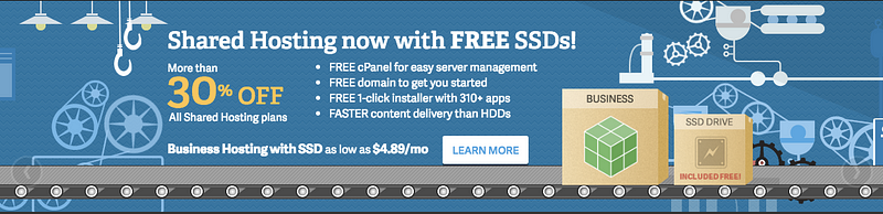
Tested users scrolled past this carousel and didn’t read anything from it.
Rotating images have been tested many times and are considered to be a poor way of presenting home page content. The information is too cluttered there and makes it very hard to read and understand. It is better to avoid carousels, because they can make things even worse. Instead, put one single image with a well-thought-out Unique Value Proposition clearly stating the benefit your users get and key advantages in competition. Create some surveys to understand why you are loved by your users, convert it into benefit and promote it as a UVP.
Hypothesis: If we remove the slideshow and use a one single image with a well-thought-out UVP, we will increase user engagement with your service.
Measurement: Quantitative and qualitative user research. CTA Button clicks. Funnel reports: % of visits going to the next step in the process. Number of Sign ups.
Hosting Pricing.
Critical: Leads to task failure. Causes user extreme irritation.

When the users were given the task to find the prices, they started to look for a pricing page, but there was no such page. When the users finally found the prices, they couldn’t tell exactly where they had clicked. This is a serious issue. Not surprising, they didn’t notice the 4 blocks with prices on the Home page. Honestly saying, I didn’t recognise them either.
These 4 blocks with prices should be given much more prominence and completely redesigned. They can include benefits, additional info, clear pricing, CTA button. This section (and most important the info that the users are looking for) is hidden now. Businesses are often nervous that prices may scare users away. They hide the prices… But users are highly goal-driven on the Web. They visit sites because there’s something they want to accomplish. The ultimate failure of a website is to fail to provide the information users are looking for. Price is the most specific piece of info customers use to understand the nature of an offering, and not providing it makes people feel lost and reduces their understanding of a product line.
Hypothesis: If we completely redesign the 4 boxes with the hosting pricing, we will increase user engagement and reduce user frustration.
Measurement: Quantitative and qualitative user research. CTA Button clicks. Funnel reports: % of visits going to the next step in the process. Number of Sign ups.
Text copy.
Minor: Causes some hesitation or slight irritation.
Tested users didn’t pay attention to home page text copy, they quickly scanned the page looking for pricing and solutions to their problems.
If your website uses “Our team is here…” or “We are the right web hosting…” or “We offer …”, you’re doing it wrong. People only care about one thing: themselves and their needs. Your website copy should be focused on what’s in it for them. User-centric, not ego-centric. Remember, features are not benefits. People don’t buy features and they don’t really buy advantages — they buy benefits. Don’t tell them what they’re getting, tell them why it matters.
Hypothesis: If we improve the text copy, we will make the service and your product more desirable, valuable, credible.
Measurement: Quantitative and qualitative user research.
To be continued…
There are many other things that can be improved to increase conversions and make the experience better. Remember, every product and service should be Useful, Usable, Desirable, Valuable, Findable, Accessible, Credible.
As usual, I want to finish with one of the mental models that can make the experience desirable. Gifting: We feel the need to reciprocate when we receive a gift.
Let’s create great products and services together!
P.S. This article and many more are available on my Medium blog page. If you want me to review your website or app, please send me a message on Twitter or at a@uxwar.co