


UX review for a travel app by Artem Kulitski
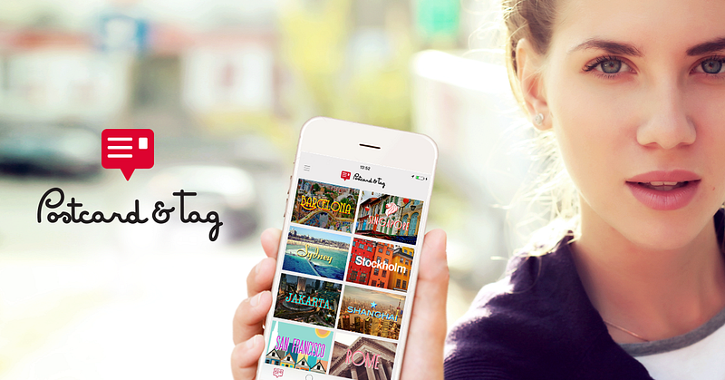
The app is called Postcard&Tag, which is a travel planning tool for holidays, trips, weekends, and nearby activities.
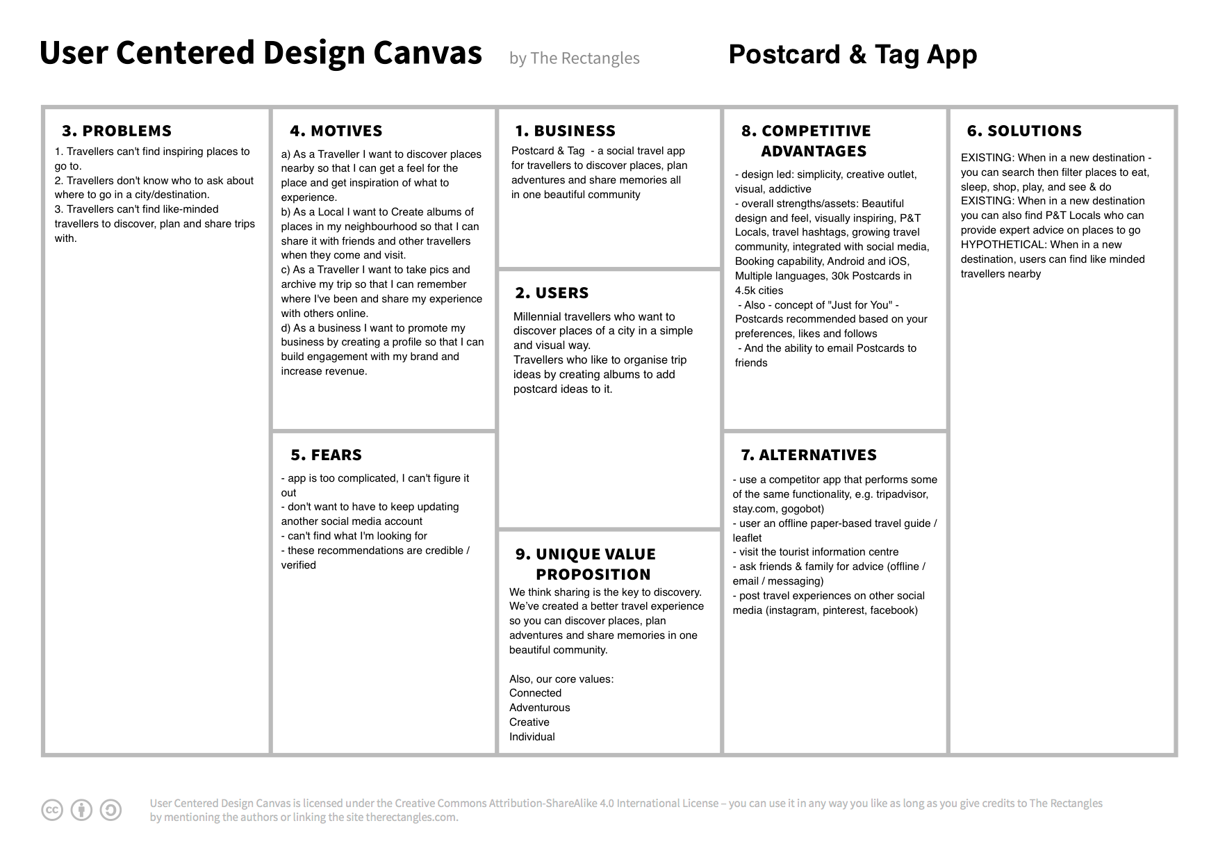
The first step was creating a User-Centred Design Canvas.
After receiving the above info, I started to review the app and test it with real users.
The below review is based on guerrilla user research as well as best UX practices, principles, heuristics and usability guidelines.
Guerrilla research and testing: 10 users, aged 18–31, interested in travelling examined the app and its functionality. They were asked to perform random tasks and provide their personal feelings and impressions. The results of this research were combined with the best UX practices and usability guidelines to systemise the present UX review.
App icon.
Tested users did not recognise the icon as something related to travel or postcards. Most common answers are:
— to do app.
— messaging.
— documents.
— email.
— recipes.
— medicine.
Hypothesis: If we change the app icon to more travel oriented, people, who are looking for travel apps, will recognise it better, which will increase downloads and returning users.
Measurement:
– Number of app downloads.
– Number of returning users.
Research:
If you can ask feedback from the existing users, this will help a lot.
Notification popup.
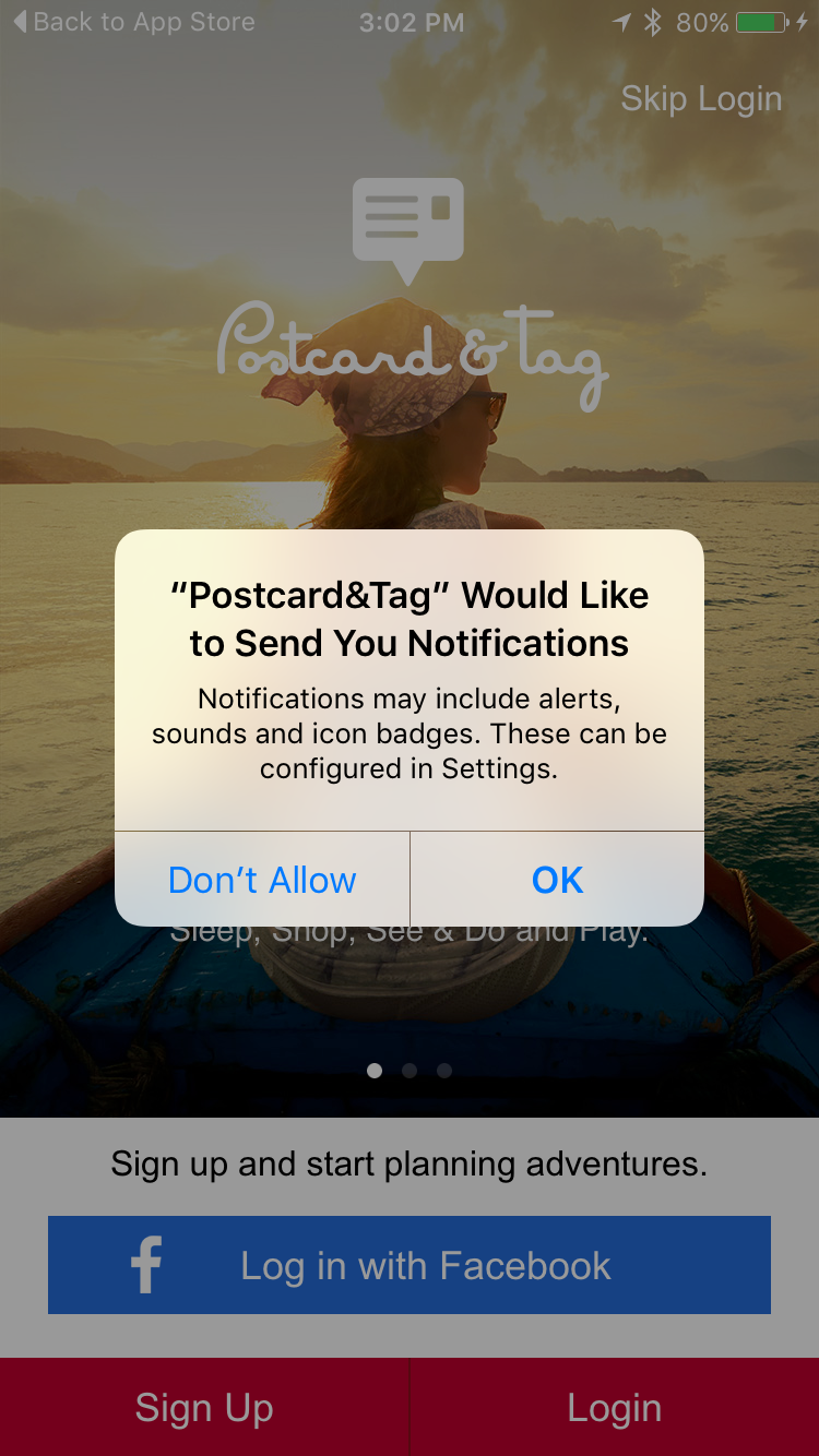
A good UX practice is to ask for notifications at later stages of app use. Explain to a user the benefits they’ll receive by allowing notifications.
Then, when the user is educated enough, the app can pop up the question.
Hypothesis:
If we put the notification pop up after the discovery slides, users will allow notifications more frequently.
Measurement:
– % of users allowing notifications.
– Qualitative and quantitative user research.
Discovery screen.
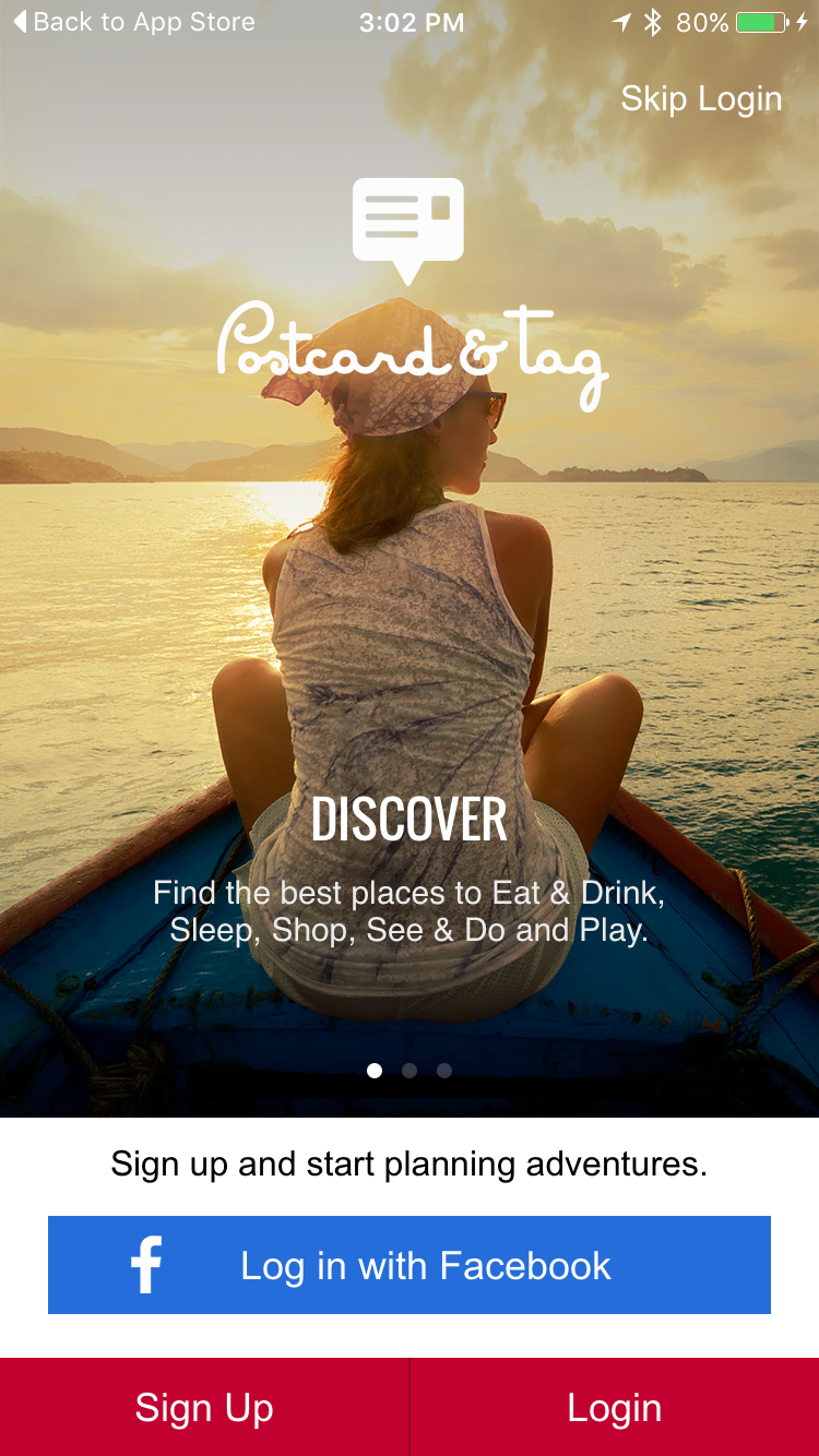
A good UX practice is to ask for sign up at later stages. Again, explain to a user the app benefits first and let them discover the app. Remove all roadblocks from this screen (i.e signup/login) and just show the discovery slides. Registration is a roadblock to adoption.
Hypothesis:
If we remove roadblocks and leave full screen discovery slides only, users
will concentrate on app discovery rather than thinking how to proceed or skipping without discovering.
Measurement:
– Bounce rate.
– % users navigating through discovery slides.
– # of sign-ups created and % of each option.
– Qualitative and quantitative user research.
Hamburger Menu.
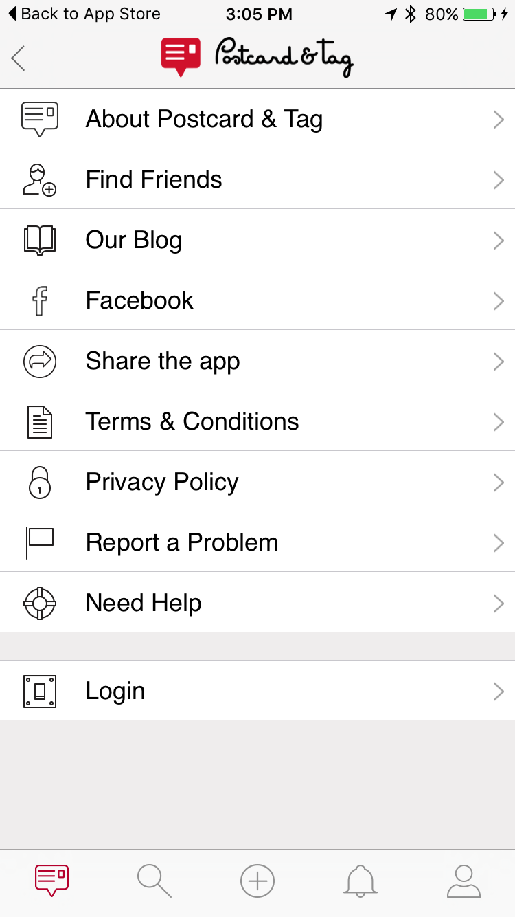
Important: Apps are not websites. Only primary navigation and content
should be visible on screen. Simple and quick.
Most of these items load slowly and go to website pages. This is not a good
UX practice, especially shown on the main screen. Please consider how
Instagram hides this info on profile screen. We can use hamburger menu with another items, as suggested in the next slides.
Hypothesis:
If we remove hamburger menu with all the items, this will help user to move straight to postcards and app journey without unnecessary distractions.
Measurement:
– User actions: look at click maps (if available)to see what users ‘click’ on. Or, look at navigation reports (next screen report) to see what content is most popular.
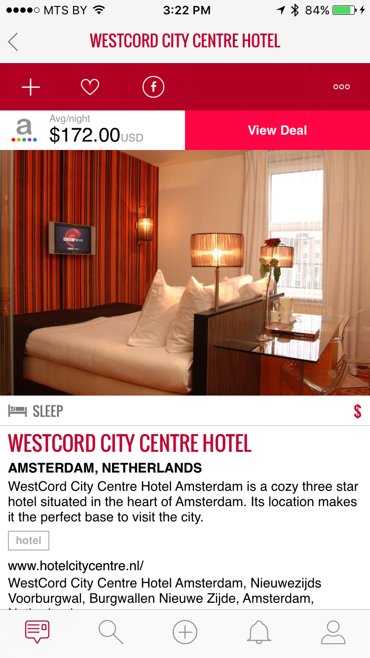
Postcards main screen (logged in).
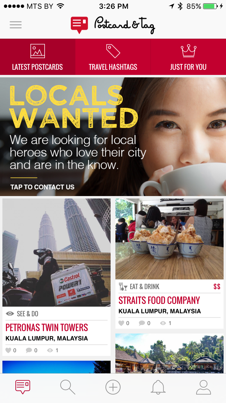
Again, apps are not websites. Only primary navigation and content
should be visible on screen. Simple and quick.
1. Remove locals wanted banner. Users I tested considered it as an ad,
which created confusion for app journey. It can be put to locals tab
on the city screen.
2. Remove tabs Latest postcards, travel hashtags, just for you or put
them under hamburger menu. Users I tested, were confused by these
tabs, which prevented them to go straight to postcards discovery
and /or other tasks. Removing tabs will rename top heading
Postcard & tag to Latest Postcards.
3. Use full width postcard, instead showing 2 small in a width. This is
not only a good UX practice, but also one of the main request from the
users I tested.
Hypothesis:
If we remove all roadblocks, this will help user to move straight
to postcards and app journey without unnecessary distractions.
Measurement:
— Time on screen: this could be maximum to indicate that users are scrolling through postcards.
— Funnel reports: % of visits going to the next step in the process.
Popular cities (not logged in).
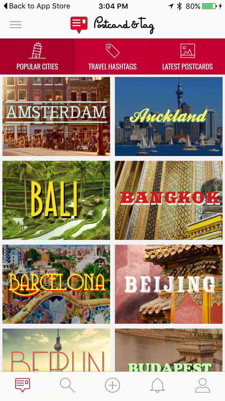
First time users, that I tested, understood the app concept better, when were presented with the popular cities screen rather than postcard screen. 7 out of 10 tested users voted it should be the primary screen, comparing to postcard
screen. “This screen explains the app quickly and clearly with good visual impact, compared to postcard screen, that seems just a collection of images.” Based on tested users, I would recommend showing this screen as a primary to both logged and non-logged users. Same as I mentioned for the postcard screen, the top tabs can be put inside the hamburger menu.
Hypothesis:
If we make this screen primary for all users, this will increase users engagement with the app and tell the app story in a more clear way.
Measurement:
— User actions: look at click maps (if available) to see what users ‘click’ on. Or, look at navigation reports (next screen report) to see what content is most popular.
— Funnel reports: % of visits going to the next step in the process.
Sharing options.
Sharing options look incomplete with 2 empty tabs. Recommend putting sharing options under the postcard image similar to how Instagram does. Same can be applied to comments. Simple, clean, familiar to the users.
This change relates to persuasive pattern known as “Recognition over recall”.
We are better at recognising things previously experienced than we are at recalling them from memory.
Hypothesis:
If we put sharing options below the image (similar to Instagram) this will increase postcard sharing.
Measurement:
— Number of postcard shares.
— Qualitative and quantitative user research and testing.
CTA Button.
Moving sharing buttons under the image will give more prominence to call to action button. Basically, CTA button should also use a different colour to be in more contrast with the rest of the colour scheme.
Image description, i.e text, font, spacing can be better to improve the readability and engagement.
Hypothesis:
If we put sharing options below the image and change colour of CTA button, we will give it more prominence and increase button clicks.
Measurement:
— Number of button clicks.
Map, comments, author.
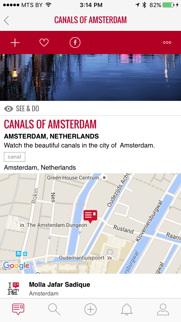
Information architecture is bit broken here. Image, description, author and comments should come together. The map can be hidden by default
and reveal by clicking a map icon (or show map). Tags can be in blue text without any borders, indicating they are clickable.
Hypothesis:
If we update information architecture on this screen, we will create a more consistent and familiar UI for users.
Measurement:
– User actions: look at click maps (if available) to see what users ‘click’ on. Or, look at navigation reports (next screen report) to see what content is most popular.
– Number of comments.
– Tag clicks.
– Shares.
Zero Data.
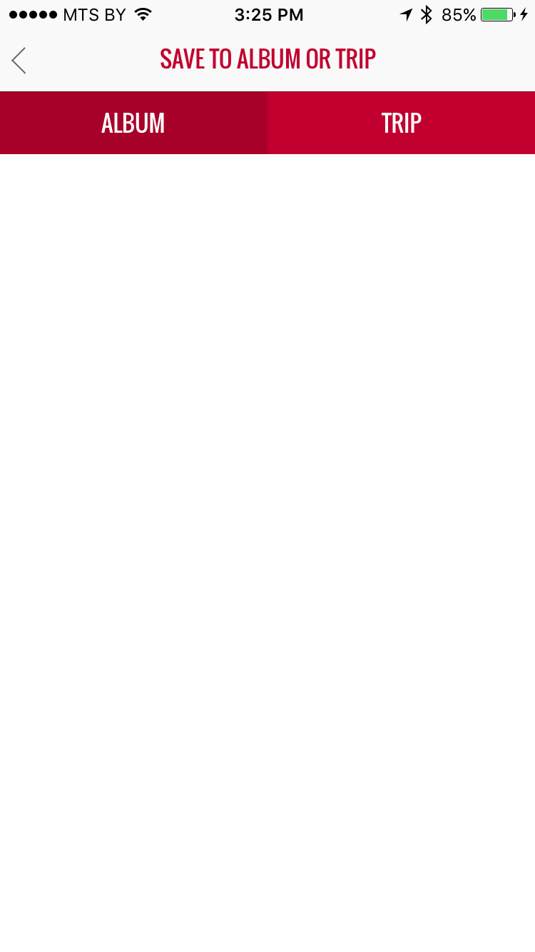
Avoid zero data. We often forget to design for this initial case when there is still nothing to display. When first time users look at your app, and all it does is show a blank state without any guidance, then you’re probably missing out on an opportunity. Add some guidance with benefits and links to create first album or a trip. Please check other screens, there are several cases of zero data.
Hypothesis:
If we add links and guidance to zero data screens, we will increase user engagement.
Measurement:
– Number of albums/trips created.
Filters.
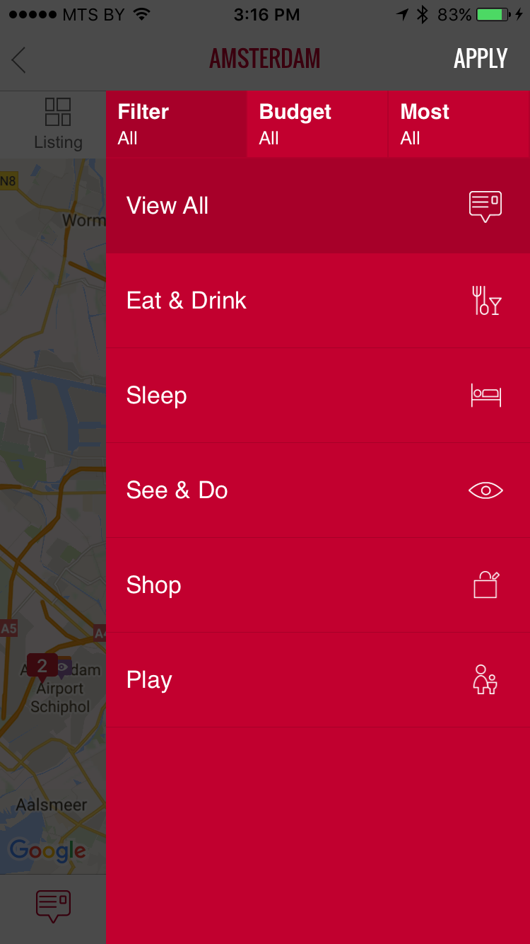
Users, that I tested, found this filter not very intuitive. I do not have specific feedback for improvement yet, but it makes sense to thoroughly test existing users, watch them navigate to find what they need. Also, it makes sense to run a competitive audit of the apps that use filters and watch how test users are performing. Create specific cases, scenarios and tasks. Probably, it makes sense to try progressive disclosure, but requires much testings.
Hypothesis:
If we test existing users and run a competitive audit to see how people use the filters, we will increase user engagement with the app functionality.
Measurement:
– Qualitative and quantitative user research.
– Specific cases and scenarios with time for task completion.
Profile.
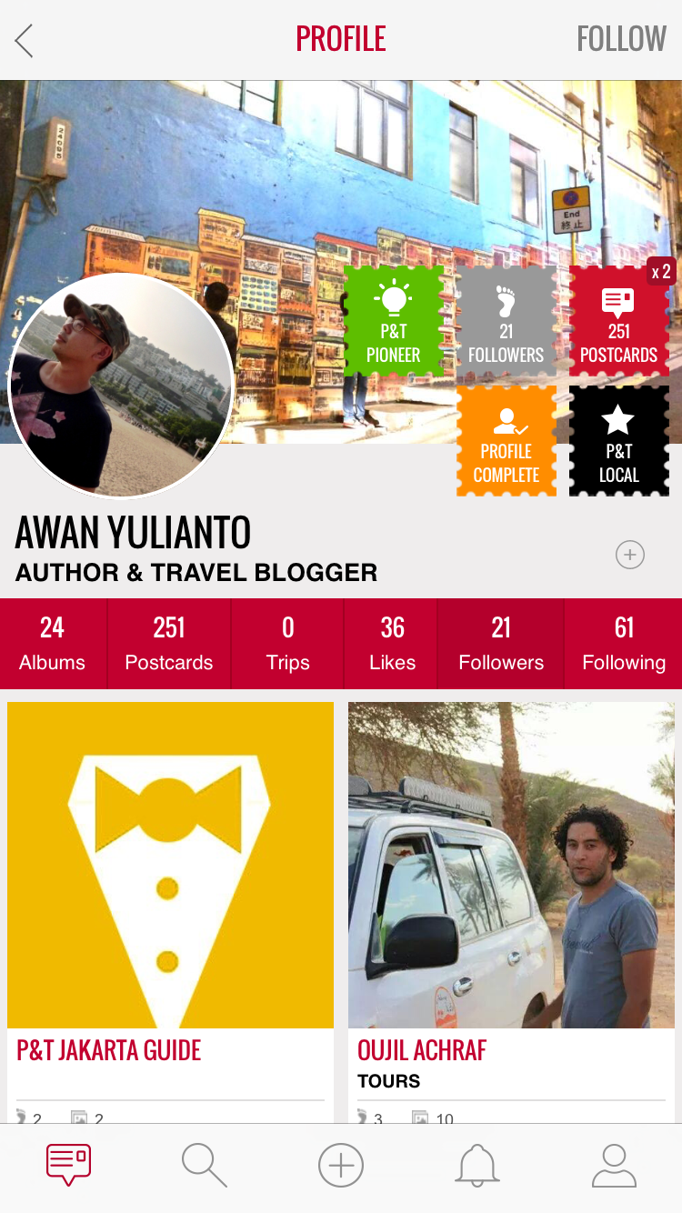
Designing interfaces with (small) elements placed close together is a recipe for disaster. Tested users had problems navigating this screen, which created confusion at different stages. Profile screen can be redesigned to be much more effective and efficient. You can look for various profile UI patterns.
Hypothesis:
If we redesign the profile screen, we will increase user engagement with their own profiles and encourage them to follow others.
Measurement:
– Qualitative and quantitative user research.
Task: Create Album with postcards.
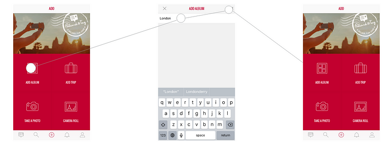
Problem: Dead End.
Users should always be informed on task completion and provided with further feedback and options/tasks to continue app journey. Tested first time users had no idea whether the album was created, where it was and what to do next. It makes sense to revise the flow, e.g showing the screen with the created album and further task to add images/postcards.
Hypothesis:
If we revise “Create Album” user flow, we will help users to continue their app journey.
Measurement:
– Qualitative and quantitative user research and usability testings.
– Funnel reports: % of visits going to the next step in the process.
Add trip scenario.
Scenario: Kira has just arrived to London. She is very inspired and wants to remember this trip. She has just downloaded a travel app “Postcard and tag”. There are many places to see and visit, so there is really not much time for her to play with the app. She wants to add a trip to her new app and create her first postcard now! Task: Add trip with postcards.
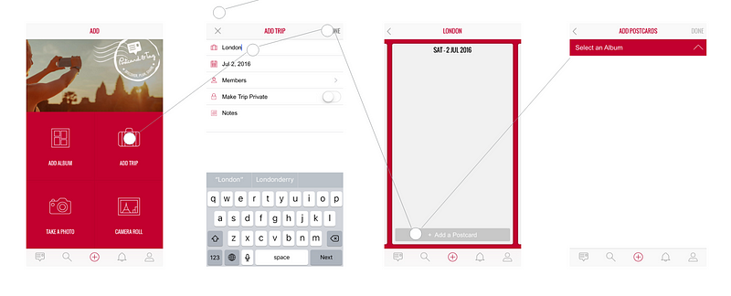
Problem: Dead End.
There are no albums created, and the user is not provided with further feedback and options/tasks to continue app journey. Remember designing for Zero Data, however in this case, the user’s initial task will be interrupted with another task (create album). The task was failed. Kira switched to another app. Solution: allow user to upload images or take pictures at
3rd step where “add postcard”. Users might not wish to create albums. Tested first time users were very confused and failed the task.
P.S. see how my flow arrows go up and down? Try to make “next step clicks” form a straight line.
Hypothesis:
If we add possibility take photos or upload images at “add postcard” step, we will help users to continue their app journey.
Measurement:
– Qualitative and quantitative user research and usability testings.
– Funnel reports: % of visits going to the next step in the process.
Side note for improvement: By clicking the plus icon it makes sense to give users ONLY the options to take photos and upload images with their further
flows (like currently implemented). We can put “manage albums” and “manage trips” to a redesigned profile screen under the hamburger menu. Currently the profile screen has a back button on the top, which can be replaced with the hamburger menu listing various options. All of the main app functionality should be simple and quick without any distractions, unnecessary roadblocks or too many options. All the rest functionality can be in the profile screen for user to play with it, customise and manage.
The simpler — the better. Don’t make users think. Mobile users want one thing. Emphasizing our core value proposition gives us a better experience overall.
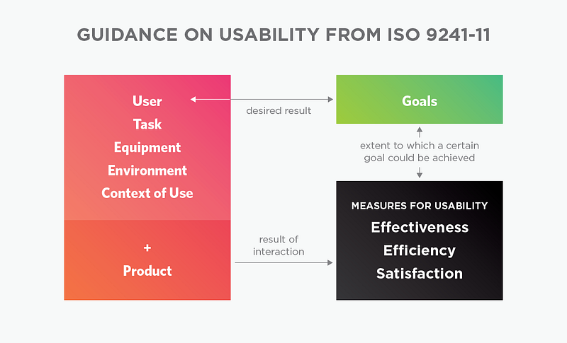
Guidance on usability.
You can create various scenarios and tasks based on the examples above
and the below guidance on usability:
Nice to try.
1.Try to increase the App Speed. It has been suggested that each second longer affects drop off, bounce and conversion rates.
2. Try Storytelling instead of tutorial for the first time users. Stories elicit a more emotional response by making it feel as if the written experience was actually encountered. As a result of this, stories may also become more memorable.
2.1 Ask people to start off with a smaller task (like uploading their first postcard) followed by some larger ones down the road.
2.2 Try Explaining instead of assuming the obvious. Some things which may seem obvious to us, might be less so to others. Using contextual explanations uncertainties may be removed in numerous ways.
3. Try Curiosity to drive up desire for something by providing a bit of teasing information. It could be a genuine content which leads up to a call to action sounding like “in order to see the rest, do XYZ”. Keep users hungry.
4. Try Thanking and providing Feedback instead of silence or simply confirming completion.
5. Try Enabling Corrections instead of rigidness. People make mistakes. Allowing correction to happen will ease the pain of having to start all over again. The UI should allow users to make subtle corrections simply and quickly.
5.1 Try Retries and Redos instead of single chances. Sometimes things will just not work out as intended during the process and users might wish to simply try again. Perhaps a file upload fails. The UI could make such redos and retries super easy. When the outcome of an action is not satisfactory and there is no way to try again, stress (and lost conversions) will surely follow.
6. Try Social Commitments instead of solitude. Social commitments may be a form of self inflicted motivation. Making a public or social promise of some sort, begins to hold us accountable. When we tell people that we’ll do something (or take publicly visible actions), there is a higher chance that we’ll actually follow through with consistent actions in the future.
Additional things to consider for improvement.
– Competitive Audit. A comprehensive analysis of competitor products that maps out their existing features in a comparable way. Helps you understand industry standards and identify opportunities to innovate in a given area. Ask users what they particularly like in competitors app and why they choose them.
– Personas. A relatable snapshot of the target audience that highlights demographics, behaviors, needs and motivations through the creation of a fictional character. Personas make it easier for designers to create empathy with consumers throughout the design process. If you do not have resources for a proper User Research, you can always refer to fictional personas and test all decisions against their needs.
– Blueprint. A map that displays all the touch-points of the consumer with your brand, as well as the key internal processes involved in it. Useful to visualize the path followed by consumers across multiple channels and how you could improve the flow.
– Ecosystem Map. A visualization of the company’s digital properties, the connections between them, and their purpose in the overall marketing strategy. Gives you insights around how to leverage new and existing assets to achieve the brand’s business goals.
– User Stories. A breakdown of each user task that can be accomplished within the product experience. Reminds the team of the motivations that drive the target audience to use each feature, as well as the path that they will take to do so. Use the examples I provided.
– Use Cases and Scenarios. A comprehensive list of scenarios that happen when users are interacting with the product: logged in, not logged in, first visit etc. Ensures that all possible actions are thoroughly considered, as well as the system behavior in each scenario. Use the examples I provided.
– Consumer Journey Map. A diagram that explores the multiple (sometimes invisible) steps taken by consumers as they engage with the service. Allows designers to frame the consumer’s motivations and needs in each step of the journey, creating design solutions that are appropriate for each.
– Micro interactions. Trigger, rules, feedback, loop. Details make the product. Bonus: Ever heard about Easter eggs?
– Gamification. Concept of applying game mechanics and game design techniques to engage and motivate people to achieve their goals.
Gamification taps into the basic desires and needs of the users impulses which revolve around the idea of Status and Achievement.
Conclusion.
So, what makes app UX great?
- Usefulness (how can it improve your user life / make tasks easier?)
- Usability (is it easy to use?)
- Desirability (does it provide any emotional attachment?)
- Accessibility ( Is the product usable by people of varying abilities and disabilities?)
- Credibility (do you use any design elements that make users believe in what you’re actually telling them with your app product?)
- Keep clutter to a minimum. All unnecessary information competes for the user’s limited attentional resources, which could inhibit user’s memory retrieval of relevant information. Therefore, the display must be reduced to only the necessary components for the current tasks, whilst providing clearly visible and unambiguous means of navigating to other content.
Set KPI.
Key Performance Indicators, also known as KPI, are quantifiable measurements that help an organization define and track the progress toward its goals. KPIs that reflect the progress toward user experience related goals can be referred to as UX KPIs.
Quantitative UX KPIs:
– Task success rate
– Time on task
– Use of search vs. navigation
– User error rate
– System Usability Scale (SUS)
Qualitative UX KPIs:
– Reported expectations and performance
– Overall satisfaction
User Research, Testing, Analytics and Metrics are the key for app success. Never design and build features by guess.
P.S. This article and many more are available on my Medium blog page. If you want me to review your website or app, please send me a message on Twitter or at a@uxclass.co