World Snooker
World Snooker Website is a Disaster. By Artem Kulitski
Several times per year I visit World Snooker website and…leave in despair. Year after year. Again and again. The most famous snooker website, number 1 on Google, millions of visitors and…search button isn’t working, videos are not playing, links not working and…”Your connection to this site is not secure”. Well, no favicon as well, but who cares?
Speed Test
What about speed test across mobile and desktop devices:
- Mobile: 57/100. Poor. It looks like http://www.worldsnooker.com/ is slow on mobile phones. Unfortunately, most people won’t wait very long before leaving a slow-loading site and tapping somewhere else.
- Desktop: 63/100. Poor. It looks like http://www.worldsnooker.com/ is slow on laptops and desktop computers. In today’s world, people expect an instantaneous response — any delay can cause them to click to another site.
Well, I would go to another site, but other snooker websites are even worse. Why does nobody care about World Snooker website? Who is in charge of it? Hope someone will read this post and fix the issues.
Missing links

Not sure who decided to put so much stuff in the header, but thanks God the top right video is not autoplaying. Well, maybe because it doesn’t play at all. At least nothing happens by clicking the video in the top right. Same for the links: WPBSA, Corporate, Play. Nothing happens. Can’t find what you need? Click Search. Click again. Click 29 times. How unlucky! It doesn’t work.
Want to watch live? Click Watch Live. It’s obvious.

Scores
Let’s check the scores, at least this is what I need most. You can click “Scores” in the main menu, or “Live Scores” on the main image. See? For some reason you are now on a subdomain http://livescores.worldsnookerdata.com/. It has consistent look and feel (good) but different menu items (confusing).

By the way, the new tab has a favicon!

So, we left the main website. Maybe we had something else to do there, but who cares? Now our attention has switched to scores, draws, calendars. Basically, this is what I am looking for. So, let’s forget the main website and try to check the Calendar.
Calendar
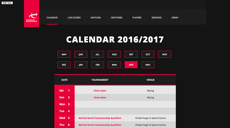
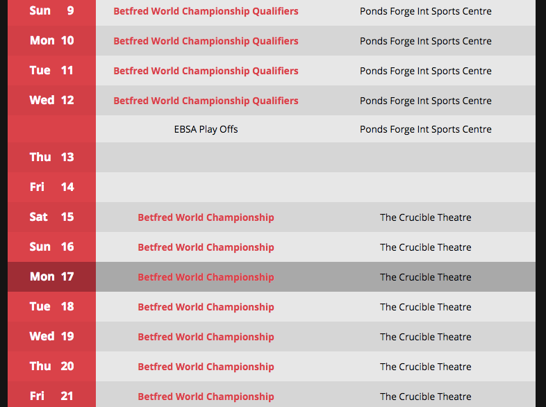
After clicking the tournaments in the calendar, it becomes clear that the issues above are not accidental. I am writing this post on April 17. I want to see live scores for April 17. It is in the middle of the calendar list:

If you click any previous date, you will see this:

Live matches for the past dates? Really? Check back again later? When? In 3017?
Clicking all future dates returns us to April 17. So, the only working link here is April 17! Why do we need the rest dates? What for is this page at all?
Live scores
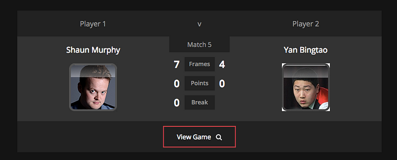
What is the difference between this:

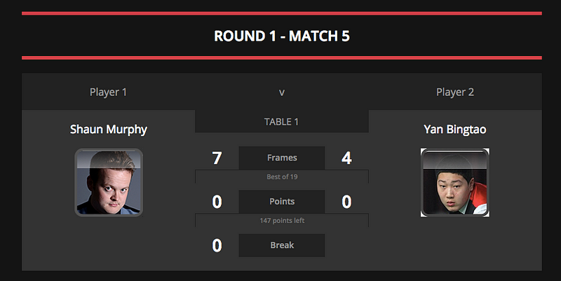
and this (after clicking “view game”):

Do we really need 2 pages for this?
Final thoughts
Honestly saying, I wanted to write this post to suggest some UX improvements, which my followers could find interesting. But in the result, I only listed the problems, which I encountered while preparing for review. In general, it would be good to have more data to prepare a decent UX review. If someone reading this post likes snooker and wants to improve World Snooker website, please share your experience. I would love to hear from you! Follow me on Twitter or email me at a@uxwar.co
Thanks for reading! This article is also available on Medium.


